
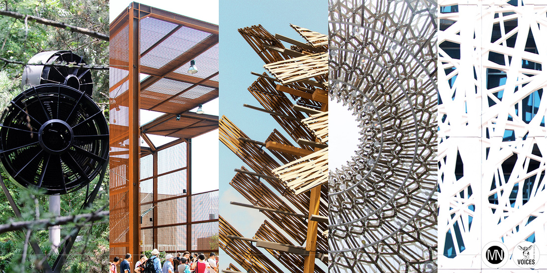
Originally published on Domusweb.it. Photo © Maria Novozhilova
| ENG Two months since Expo 2015 opened, in an attempt to cast light on the matter, we analysed nearly 1.7 million posts, with the assistance of VOICES from the Blogs, a spin-off of Milan University. | IT A due mesi dall’apertura, proviamo a tratteggiare un primo ritratto di Expo 2015 attraverso le opinioni dei visitatori espresse sui social e raccolte da VOICES from the Blogs, spin-off dell’Università di Milano |
| It is now two months since Expo 2015 opened, more than long enough for us to start taking stock of the event in Milan and to monitor visitor trends and opinions on the Universal Exposition Pavilions. | A due mesi dall’inaugurazione di Expo 2015, possiamo cominciare a tirare le prime somme dell’evento milanese, osservando le tendenze di visita e le opinioni dei visitatori sui padiglioni dell’Esposizione Universale. |
Expo 2015 and socials © Domus / VOICES from the Blogs / Arch. Maria Novozhilova
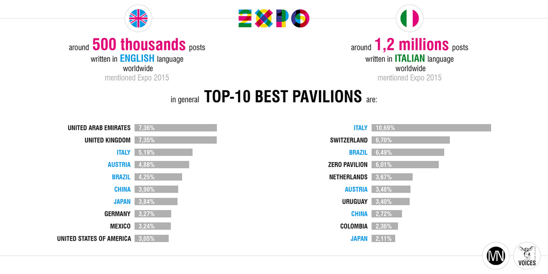
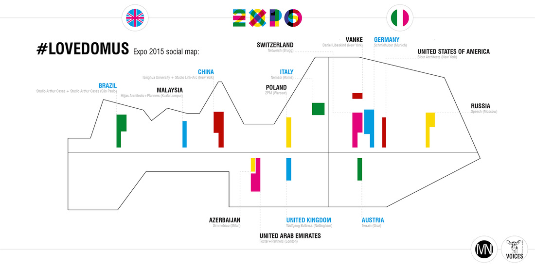
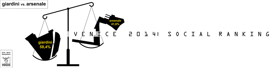
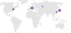
| After all is said and done, they have been the true focus of Expos for the past 160 years, featuring innovation, design and architecture, sometimes bold, other times less so. In an attempt to cast light on the matter, we analysed the nearly 1.7 million posts written about the Expo in Italian and English over the past 60 days, with the assistance of VOICES from the Blogs, a spin-off of Milan University and a leader in Big Data analytics. This substantial amount of data well reflects the event’s current popularity but also provides a new and interesting key to the impressions of those who visit a Pavilion (perhaps virtually but more often in real life) and immediately afterwards start tweeting about their firsthand experience, or posting on Instagram or other social media. A virtual real-time monitoring of Expo social-genics which, among other things, highlights fascinating differences between local visitors (who write mostly in Italian) and international ones. Which pavilions are the most popular, generally speaking? In the English-language rating, the top two spots for the largest number of positive mentions go to United Arab Emirates Pavilion (7.36%) and that of the United Kingdom (7.35%) but these two are absent from the “Italian” top ten. The efforts of nearby Switzerland (6.70%) and Pavilion Zero (6.01%) are much appreciated by “local” visitors but tend to be overlooked by foreigners. | Perché dopotutto, da 160 anni a questa parte, sono loro i veri protagonisti dell’Expo, tra innovazione, design e architetture più o meno ardite. Per cercare quindi di fare un po’ di luce a riguardo, abbiamo voluto analizzare i quasi 1,7 milioni di post scritti in italiano e in inglese che hanno discusso di Expo negli ultimi 60 giorni, attraverso l’aiuto di VOICES the Blogs, spin-off dell’Università degli Studi di Milano e società leader in Big Data analytics. Una mole di dati considerevole che da un lato ben riflette la popolarità che sta avendo Expo 2015, ma che, dall’altro, fornisce anche una chiave di lettura inedita e interessante delle impressioni degli utenti dell’evento. Che visitano un padiglione (magari virtualmente, o più spesso dal vivo), e che subito dopo twittano o postano su Instagram o altri social la loro esperienza diretta. Praticamente un monitoraggio in real-time della social-genecità di Expo, che fa emergere tra l’altro delle interessanti differenze tra pubblico locale (che scrive principalmente in italiano) e quello internazionale. Partiamo dal capire quali sono stati i padiglioni che sono piaciuti di più in termini generali: nella classifica in inglese ai primi due posti come maggior numero di menzioni positive troviamo il padiglione degli Emirati Arabi Uniti (7,36%) e quello del Regno Unito (7,35%), che risultano invece assenti nella top-10 “italiana”. D’altro lato, la partecipazione della vicina Svizzera (6,70%) e il Padiglione Zero (6,01%) che sembrano essere stati così apprezzati dal pubblico “locale”, risultano più trascurati dagli stranieri. |
Expo 2015 and socials © Domus / VOICES from the Blogs / Arch. Maria Novozhilova
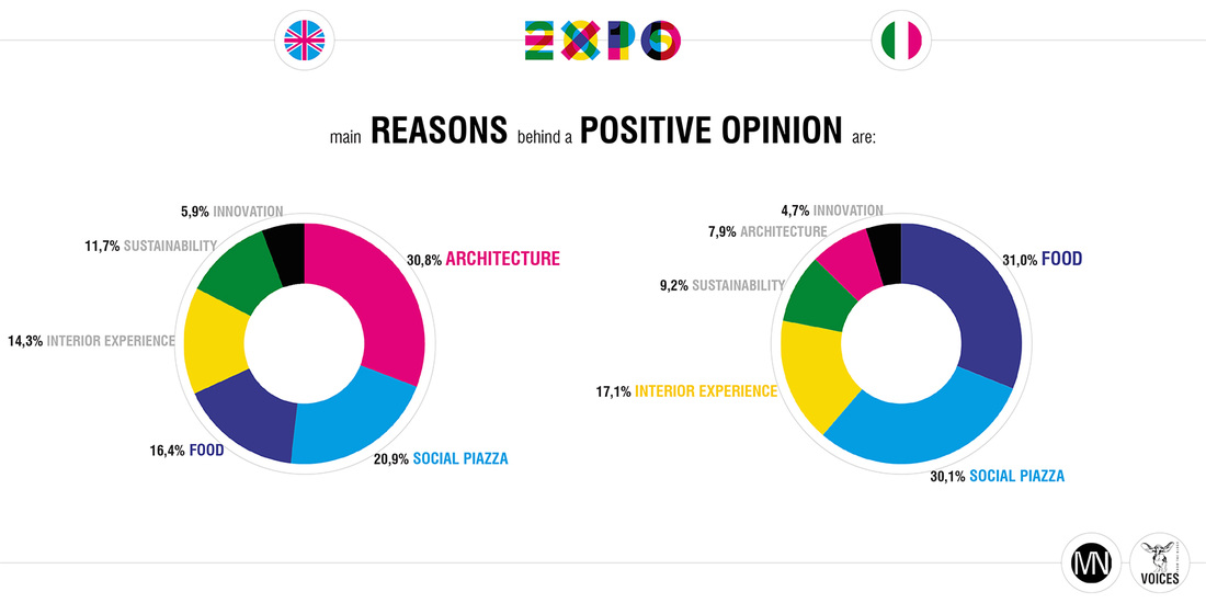
| How can such differences be explained? The mystery is resolved, at least in part, when we analyse the principal motivations behind opinions expressed online regarding the individual pavilions. Although those writing in English focus primarily on the architecture (30.8%), for those writing in Italian the number one reason to speak (well) of pavilions is a love of the “traditional” panem et circenses (bread and circuses) that has been around for approximately 2,000 years. Food (31.0%) and events (30.1%) emerge as their real priorities. | Come spiegare queste differenze? Il mistero, almeno in parte, si svela se passiamo ad analizzare le principali motivazioni dietro agli apprezzamenti espressi on-line verso i singoli padiglioni. Se per chi scrive in inglese è soprattutto l’architettura (30,8%) l’occasione numero-uno per parlare (bene) dei padiglioni dell’Expo, per chi scrive in italiano la preferenza va al “classico” da 2 mila anni a questa parte panem et circenses. Così i temi del cibo (31,0%) e degli eventi (30,1%) emergono come le vere priorità. |
Expo 2015 and socials © Domus / VOICES from the Blogs / Arch. Maria Novozhilova
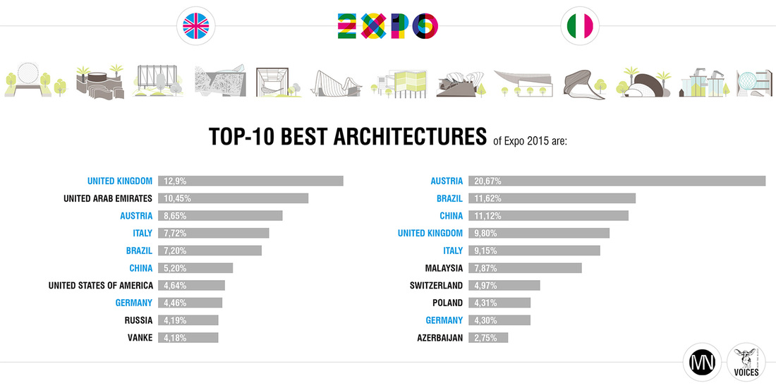
| However, do the two worlds remain so far apart if we remove the “mundane” and focus only on comments regarding pavilion design? Certain differences remain but the top slots in the two tables start to look more alike. The lovely honeycomb structure of the United Kingdom Pavilion (designed by Wolfgang Buttress and BDP) tops the ratings in English (12.9%) and comes fourth in the Italian table (9.8%). Breathe.Austria, or rather the new sustainable urban architecture format that seeks to restore oxygen to large polluted metropolises (designed by Klaus K. Loenhart and Terrain), comes first for the Italians (20.67%) and third for the rest of the world (8.65%). Similarly, the Italian Pavilion, designed by Nemesi and often mentioned for its appealing facade, great innovation and sustainability, is in the top 5 in English-language and Italian posts. The two tables are more closely connected and this also applies to other national pavilions such as those of Brazil, China and Germany. You might say what food divides, architecture unites. | Ma tolti gli argomenti “mondani”, e focalizzandoci solo sui commenti relativi all’aspetto progettuale dei padiglioni dell’Expo, i due mondi appaiono ancora così agli antipodi? Nonostante il fatto che certe differenze permangono (un fatto comunque inevitabile – dopotutto de gustibus non disputandum est), i primi posti delle due classifiche si assomigliano di più. La suggestiva struttura a forma d’alveare del Regno Unito (progettata da Wolfgang Buttress e dallo studio BDP) si piazza al primo posto nella classifica inglese (12,9%), e al quarto in quella italiana (9,8%). Il Breath.Austria o, meglio, il nuovo format d’architettura urbana sostenibile che mira a ridare ossigeno alle grandi metropoli inquinate (progettato da Klaus K. Loenhart e studio Terrain) è primo per gli italiani (20,67%) ed è terzo per il resto del mondo (8,65%). Allo stesso modo, Palazzo Italia (disegnato da Nemesi studio) che spesso viene discusso per la sua facciata allettante e nello stesso tempo estremamente innovativa e sostenibile, è nella top-5 sia in lingua inglese che italiana. Insomma, le due classifiche si parlano di più, dato che quanto appena notato vale anche per altri padiglioni come quello del Brasile, della Cina e della Germania. Insomma, verrebbe da dire che ciò che il cibo divide, l’architettura unisce! |
Expo 2015 and socials © Domus / VOICES from the Blogs / Arch. Maria Novozhilova
| This first social analysis on the pavilions provides plenty of ideas but it will be interesting to see what happens over the remaining two thirds of the Expo period... Read the original article & see more pictures in my article on Domus, | Le suggestioni da questa prima analisi social sui padiglioni dunque non mancano. Sarà interessante capire nei rimanenti due terzi di Expo cosa succederà. E parlando di Expo, le sorprese di certo non dovrebbero latitare… Scopri di più nel mio articolo originale su Domus. |
Text and infographics exclusively for DomusWeb Italy by Maria Novozhilova
Follow me on twitter at @NovozhilovaM
Follow me on instagram at @MN.Blog
Follow me on twitter at @NovozhilovaM
Follow me on instagram at @MN.Blog
 |  |
You might like also...


 RSS Feed
